We all know that primary colours are red, yellow and blue and that red and yellow make orange and yellow and are secondary colours but do you know which of these work well together?
Lets start right at the beginning...
Here is a basic colour wheel, print it off if you dont have one already :)
 It is composed of your primaries (Red, Yellow and Blue) Next but one are your secondaries (Green, orange and violet) and your Tertiaries which are a mix of a secondary and a primary (Red-orange, yellow-orange, yellow-green, blue-green, blue-violet and red-violet.
You may have also heard the terms shade, tint and tone, what are these?
• Tint - Color + White (Red+White=Pink thus pink is a tint of red)
• Tone - Color + Grey (These make pastels)
• Shade - Color + Black (Red+Black=Burgundy thus burgundy is a shade of red)
• Value - How light or dark a color is.
• Aggressive - AKA 'Warm'. The yellows, oranges, and reds. These come towards the eye more (spatially) and are generally 'louder' than passive colors.
• Passive - AKA 'Cool'. The greens, blues, and violets. These recede from the eye more (spatially) and are generally 'quieter' than the aggressive colors.
OK so what colours go together?
There are 6 common colour schemes used in art & design. These are Monochromatic, complimentary, analogous, split complimentary, triatic and tetradic.
MONOCHROMATIC
Monochromatic colours are all the hues (tints and shades) of a single color. The tints and shades add depth and highlights. Simply select one "portion" such as blue from the colour wheel. The example is a blue-green monochromatic.

COMPLIMENTARY
Complimentary colours are those directly opposite each other on the wheel e.g red & green; blue & orange. They look good together and compliment each other. You can use them to create sharp contrasts or mix them to create a neutral grey.

ANALOGOUS
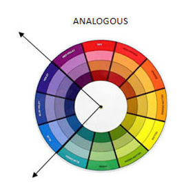
These are colours next to each other on a colour wheel. Select any quarter of the wheel for an Analogous colour scheme.
As they are similar to each other they blend well particularly if one colour is used as the dominant and the others to add highlights. They create a sense of harmony and blend well together and are effective at showing depth. You will use this in your colouring such as with copic markers.
 SPLIT COMPLIMENTARY
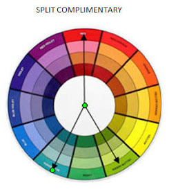
The split complementary scheme is a variation of the standard complementary scheme. It uses a colour and then two colors adjacent to its complementary. It is a good choice for beginners, I use it the most myself!

TRIATIC
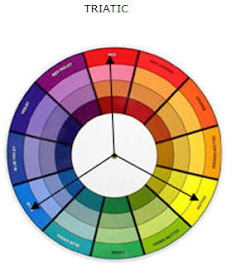
Probably the most common scheme used in cardmaking and scrapbooking, this involves using three colours spaced evenly around the wheel as it balances warm and cool colours. For best use let one colour dominate and use the others as highlights. It gives a strong visual contrast while maintaining balance.
 TETRADIC
The tetradic (also known as a double complementary) scheme uses four colours arranged into two complementary color pairs (as in a rectangle). This colour scheme can be difficult to use in equal amounts so you should choose one of the colours to be dominant and the others to highlight.


Wow! Thank you for the lesson. I really mean that - I bookmarked this particular entry so I can come back & reference it.
ReplyDeleteThis is a really great tutorial! Thanks for all this info! Really helps!
ReplyDeletethis has been very informative, thanks vix
ReplyDeleteJudie xx
Hi i have booked marked it because i would love to say i will remeber it but wont. Didnt know there was soo much so will use it alot. Mind you now need more pens. lol
ReplyDeleteThanks for this hun much appreciated. I think I'll bookmark it too for future reference. Thanks again
ReplyDeleteSam x
Wow is it ok if I like this post on my blog? So much information thankyou!! I'd love to have it in easy reference and other people can see it too!
ReplyDeletelol I meant link....
ReplyDeletefabulous tutorial. I found you via jessica blog
ReplyDeletehugs clare x
This is great! I learned this stuff in college but hadn't thought about it in a while. The colors are not so hard for me, it's layering patterns on patterns that are difficult. Which I learn a lot by watching. But, I bookmarked this because it is so helpful to remember! Thank you for the very applicable tutorial.
ReplyDeleteWow, this is really helpful! Thanks so much for sharing.
ReplyDeleteThis is awesome! So perfect! I've saved this and I know I'll be referencing it often! I found you by doing a search, and let me tell you, after clicking on many links, your tutorial has been the most informative, but also the easiest to understand. THANK YOU!!! :-)
ReplyDelete