We are grateful for our lovely followers

Follow on Bloglovin

Google Website Translator Gadget

Showing posts with label tutorial. Show all posts

Saturday, 16 January 2010

TUTORIAL - DISTRESS INKS (1) EASY BACKGROUNDS

Welcome to our first tutorial on using distress inks. There are so many uses for them and this tutorial is to show how to make easy peasy backgrounds that can be used for several styles of design.
For this you will need a craft mat that wipes clean. I personally use a non stick cooking sheet I bought in the pound shop.

Step 1 - Select your colours, minimal or multiple, they all look good together and you never get a "bad" background! For this I have used vintage photo, faded jeans and spiced marmalade.


STEP 2

Start with your lightest colour and dab and swipe this on the sheet randomly (or organised, its your sheet!) Repeat with your darker colours.

STEP 3

Spritz some water onto the sheet to activate the ink. Let all the colours mingle. If you want a bit of glam added then spray one or two spritzes of a gold or silver such as starburst stains, radiant rain or cosmic shimmers. Dont add too much glam, just a touch is enough :)


STEP 4

Take a piece of card and lay this over your wet ink, move it around to pick it up. If there are any white spaces left then just lay the card down and repeat. The more water you add the lighter the colours will be so if mine looks too light I dab the ink back on and do it again until I'm happy. Also they will dry lighter than what they look like wet so bear that in mind.


STEP 5

If you want some concentrated colour I dab the inkpad diectly on the sheet and give it a quick spray (You can see this on the blue areas here)


You can also dab them on direct to paper (DTP) and leave them as they are to make patterns as in the pic below.

STEP 6
Select a nice area with a good mix of colour and stamp onto it! Easy as that! You can also use your pieces in embossing folders such as the cuttlebug to make interesting and unique backgrounds that you've made yourself! Make sure your piece is completely dry before you cuttlebug as it will tear (unless you like that look anyhow!)
For this finished piece I simply stamped and tore around the image then I used a piece of sponge to push some brown distress inks around the edge.
I hope you have a try with this technique, there's nothing better than creating your own backgrounds and papers, have fun!

Friday, 27 November 2009

TUTORIAL - STAMPING - MASKING

You may have heard the term "Masking" but aren't quite sure what it is or you may have seen images put together with no overlap of lines and wondered how its done so we'll show you how!

This technique is called Masking as it hides (or masks) another image you can overstamp.

You will need your stamps and some post it notes. A piece of paper is fine but post it notes are tacky on the back allowing you to stamp without the mask moving giving you both hands to work with.

You need to decide on your image layout, what is going to be the furthest away object and which is the nearest? Start with your nearest object, in this it is the lady in the lake.

Stamp into your blank card and then stamp again onto your post it note and cut the image out as close to the lines as you can get it. Try and make sure part of your image is stamped where the tacky bit is on the back as this will hold it in place.

Place your cut out mask over your stamped image as below. This will allow you to stamp objects further away without leaving lines over your original image.


Stamp your next furthest image where you would like it as the picture below shows. Continue with masking your next layer if you wish to add more images as I have done with the mountain in the background.


The finished item. You may notice a slight gap around the lady, I didn't cut close enough which will leave a gap like that so its important to cut as close to the lines as you can.


Here's another example of masking that Lisa did for our stamping challenge 7 without the gap so you can see the difference (plus she did a better job of it lol!)


Monday, 7 September 2009

TUTORIAL - ADDING DIMENSION (3D)

A very popular technique in cardmaking is 3d decoupage. It is available widely as pre printed sheets and you will often see step by step ones where they contain the whole image and various pieces of the design such as this sheet (Transport decoupage by La Pashe) below.
This makes starting 3d extremely easy!

If you have dexterity problems there are now even "pop out" sheets available so no cutting involved making it a popular technique for many cardmakers newer and more experienced.

Many newer cardmakers start with 3d decoupage sheets and may move onto stamping. That doesn't mean you can't use them anymore, there are some beautiful designs available that unless you're an expert at colouring you can't replicate so intermix them with your stamping, make custom backgrounds to go with them or mix and match them with other techniques. Its also quite theraputic to sit down and cut out your designs ready for use on a rainy day!

So how do you make them 3d?

It tends to be a personal choice, most people use either silicone glue or 3d foam pads which are small squares that come in varying thickness (usually 1-2mm) There are clear foam pads now available but I haven't seen them yet!
TIP! For smaller areas you can cut the foam pads to size!

You build up your designs in layers as the decoupage sheet pic shows above and simply add your silicone or foam pads to the back and layer them on top of each other. Most designs are between 2 and 5 layers. If they have a greater number of layers I tend to use a lower thickness in foam pads (1mm) otherwise they do get very bulky! For 2 or 3 layer designs I use 2mm.

Here's an example of a 3d decoupage design on a freebie sky background I printed out.


This shows the layers between the design using foam pads which aren't visible when viewed on the front.


3d is not limited to pre printed sheets either. Many stampers use it in their work to add that extra dimension. The difference is that YOU need to decide which bits are 3d! Many crafters struggle with this but its soooo easy! Look in front of you now. You'll probably see the keyboard with the monitor further away. Imagine taking a snapshot so you would have the base layer as the monitor and add to your design with the keyboard being the top layer as its nearest to you, look at the image and decide which parts are nearest to you and start with the ones furthest away, see Simples!

For stampers most usually colour and cut out a whole image and mount it onto a panel using 3d pads such as the GDT from challenge 2 example from Lilian Tan


Others make areas of the design 3d just to give some depth like this below (Image is by Victoria Case Art Designs) The image is a digital stamp and I have copied the flowers and printed a sheet of them out (so I can use the flowers elsewhere too!) This adds some depth as the fairy is clearly sitting behind the leaves at the front.


Below is another example of stamping 3d. Firstly I stamped the floral design and coloured in then stamped again and cut out parts of the image and mounted these with foam pads so some flowers and leaves are further back and some are nearer the front giving the image some depth.


If you've never tried 3d before either as printed sheets or used with stamping have a go! It brings a whole new look to your work!

Tuesday, 18 August 2009

TUTORIAL - COLOUR THEORY

You've started making cards and things are going well but sometimes something just doesnt look right which you cant quite put your finger on.... Be honest, how many have actually read card composition and colour theory (what??) LOL! OK I'm a totally addicted crafter, I like to learn about my tools to get the best out of them and tools of making cards, scrapbooks and the like also include the use of colour.

We all know that primary colours are red, yellow and blue and that red and yellow make orange and yellow and are secondary colours but do you know which of these work well together?

Lets start right at the beginning...
Here is a basic colour wheel, print it off if you dont have one already :)


It is composed of your primaries (Red, Yellow and Blue) Next but one are your secondaries (Green, orange and violet) and your Tertiaries which are a mix of a secondary and a primary (Red-orange, yellow-orange, yellow-green, blue-green, blue-violet and red-violet.

You may have also heard the terms shade, tint and tone, what are these?


• Tint - Color + White (Red+White=Pink thus pink is a tint of red)

• Tone - Color + Grey (These make pastels)

• Shade - Color + Black (Red+Black=Burgundy thus burgundy is a shade of red)

• Value - How light or dark a color is.

• Aggressive - AKA 'Warm'. The yellows, oranges, and reds. These come towards the eye more (spatially) and are generally 'louder' than passive colors.


• Passive - AKA 'Cool'. The greens, blues, and violets. These recede from the eye more (spatially) and are generally 'quieter' than the aggressive colors.


OK so what colours go together?


There are 6 common colour schemes used in art & design. These are Monochromatic, complimentary, analogous, split complimentary, triatic and tetradic.

MONOCHROMATIC
Monochromatic colours are all the hues (tints and shades) of a single color. The tints and shades add depth and highlights. Simply select one "portion" such as blue from the colour wheel. The example is a blue-green monochromatic.


COMPLIMENTARY
Complimentary colours are those directly opposite each other on the wheel e.g red & green; blue & orange. They look good together and compliment each other. You can use them to create sharp contrasts or mix them to create a neutral grey.


ANALOGOUS
These are colours next to each other on a colour wheel. Select any quarter of the wheel for an Analogous colour scheme.
As they are similar to each other they blend well particularly if one colour is used as the dominant and the others to add highlights. They create a sense of harmony and blend well together and are effective at showing depth. You will use this in your colouring such as with copic markers.

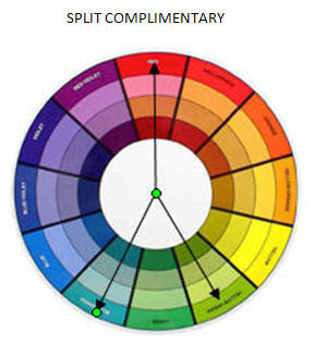
SPLIT COMPLIMENTARY
The split complementary scheme is a variation of the standard complementary scheme. It uses a colour and then two colors adjacent to its complementary. It is a good choice for beginners, I use it the most myself!


TRIATIC
Probably the most common scheme used in cardmaking and scrapbooking, this involves using three colours spaced evenly around the wheel as it balances warm and cool colours. For best use let one colour dominate and use the others as highlights. It gives a strong visual contrast while maintaining balance.

TETRADIC
The tetradic (also known as a double complementary) scheme uses four colours arranged into two complementary color pairs (as in a rectangle). This colour scheme can be difficult to use in equal amounts so you should choose one of the colours to be dominant and the others to highlight.

And finally below is another snazzy colour wheel showing more shades and tints. I have this one on my wall and find it really useful in selecting colour schemes.